
Univers: A New Sans Serif Type by Adrian Frutiger
By: Emily Ruder
- Modern technical devices make it very easy to produce typefaces.
- Is the progress of mechanic typefounding equal to the visual aspect to handmade type.
- New Types are not intended to last.
- Every typographer can name classic fonts but don't know many new fonts.
- Every press works with one of more standard.
- It looks like our own age is attracted to ephemeral and aviods standard typefaces.
- Swiss Designer Adrian Frutiger worked in Paris to design a new san serif typeface
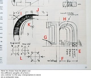
- Instead of adhering to conventional principles of construction Frutiger used forms which permit a rich interplay of visual effect.
- To emphasize the visual character of the letters the larger sizes are varied.
- The strokes are that are joined are slightly conical in shape.
- The height of capitals are varied.
- The upper parts of g, m, n, p, q are condenced.
- The lower parts of a, b, d, and u are expanded.
- The c is made narrower than o because the white space it makes makes it optically as broad.
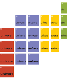
- Frutiger's method of allowing all 21 sizes from the beginning was new.
- Univers was prepared in the first place for electric composing machine "Lumitype."
- Altogether there are 17,280 letters and punctuation marks.

No comments:
Post a Comment