- Post modernism
- pop is born
- Experimental alternative publishing
- push pin studios
- new wave typography
- wolfgang weingart
- Rosmiare Tissi
- Siegfried Odermatt
- April Grieman
- Paul Scher
- Charles Anderson
- Nevel Brody
- Jacques Derrida
- Ed fella
- David Carson
- Emigre
- Deconstruction
- Post structurlism
- Mau
- Challenging Heiarchies
- Benjamin Saviginac
- Jonathan Barnbrook
Wednesday, April 14, 2010
Post modern 4/14
Wednesday, April 7, 2010
unit 3 4/7
- Hoffmann
- Brockman
- The swiss grid
- Paul Rand
- Lester Beal
- Saul Bass
- Thompson
- Cherymayeff
- Vignelli
- Knoll
- Henry Wolf
- Lois
- Photo-Typography
- Herb Lubalin
Discourse 2
Please count this Article as my second discourse
Name: Kelsey DeGenaro
Title: Univers: A New San Serif Type by Adrian Frutiger
Date Posted: Wednesday March 3
Time Posted: 12:32 AM
Name: Kelsey DeGenaro
Title: Univers: A New San Serif Type by Adrian Frutiger
Date Posted: Wednesday March 3
Time Posted: 12:32 AM
Wednesday, March 31, 2010
Unit 3 3/31
- Isotypes
- Neurath
- Modley
- Sutnar
- Walker Evans
- Beal
- Paul Rand
- Brodovitch
- Claude Shannon
- School of ULM
- Max Bill
- Theo Ballmer
- Anton Stankowski
Wednesday, March 17, 2010
Video Games
As the Head of the Instrumentation Division at Brookhaven National Laboratory, Willy Higinbotham, invented the world's first video game Tennis for Two Video Game in 1958, to entertain visitors to the Brookhaven National Laboratory. The main purpose of video games is to entertain so I would say that he was very accurate in the purpose of video games. Higinbotham never pattend his video game so I suspect that did not think they would have such an impact on modern culture.
The Video game in the laws of media:
1. The video game enhances many different Human traits, a video game is of course visual so it enhances the sense of sight. I also think the video game help enhance touch with hand eye coordination that becomes apparent in most modern games. Now with the wii more and more becomes beneficial to humans, weight lost and excessive in now even available. The video game also helps the mind with memory and a form of education, games have been delveloped for schools such as reading rabbit and math blasters.
2. The video game was so new in its time that there was nothing like it technology wise. It would be hard to what type technology became obsolesce because of it but what types of activities have been replaced. Less and less children play outside and stay active to stay inside and play video games. Playing outside or playing board games has not become obsolesce but one could definitely say that they no longer see as many children outside as they used to. One negative aspect of this is the lack of exercise that children are receiving. Video games could be a direct contributor to obessity amoungst children.
3.Video games could very well be a revival of the board game. Its a form of interactive entertainment that has been improved uponed in a technological way. I still love to play board games with my faimly so I wouldn't that they were completly obsolese but they arent used as much. People love video games and I don't think there will ever be an end to them.
4.Video Games get blamed for a lot of things. I do not think the original inventor of the video game expected it to completly take control of some peoples lifes. Or take control of the main type of entertainment amongst children in this modern age. Video Games often gets blamed for the obisiety amoungst children like I stated above but, only partly. I think it is the parents responsibility to take the video game away fromt he children and make them play outside. Video games also get blamed for violence in people. Video games are violet but I dont think this has contributed to the violence of the population. Society has always been violent as long as history has accorded so the addition of the video games is irrelivant in that factor.
The laws make plenty of sense to the world around us. They can be applied to almost everything, so that directly shows how truthful they turn out to be. The laws were very relevant to the video game in many different ways. The video game replaced interactive entertainment as the laws basically said this sort of thing would happen. Will these sort of laws have potential to change me as a designer? Perhaps but only slightly, I think anysort of thing could come back or be popular weather the law states it or not.
Wednesday, March 3, 2010
After Bauhaus 3/3/10
- Dutch Modernism
- Paul Shoetma
- Hendrick N Werkman
- Piet Zwart
- Abraham Games, Jean Carlu, and Herbert Bayer
- Post Cubism Art Deco
- Futura
- AM Cassandre
- McKnight Kauffer
- Underground railway company
- Joseph Binder
- Schulz Neudamn
- Ludwig Hohlwien
- Propaganda ww2
- montgomery Flag
- Herbert Matter
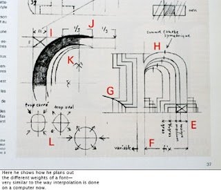
Univers: A New Sans Serif Type by Adrian Frutiger


Univers: A New Sans Serif Type by Adrian Frutiger
By: Emily Ruder
- Modern technical devices make it very easy to produce typefaces.
- Is the progress of mechanic typefounding equal to the visual aspect to handmade type.
- New Types are not intended to last.
- Every typographer can name classic fonts but don't know many new fonts.
- Every press works with one of more standard.
- It looks like our own age is attracted to ephemeral and aviods standard typefaces.
- Swiss Designer Adrian Frutiger worked in Paris to design a new san serif typeface
- Instead of adhering to conventional principles of construction Frutiger used forms which permit a rich interplay of visual effect.
- To emphasize the visual character of the letters the larger sizes are varied.
- The strokes are that are joined are slightly conical in shape.
- The height of capitals are varied.
- The upper parts of g, m, n, p, q are condenced.
- The lower parts of a, b, d, and u are expanded.
- The c is made narrower than o because the white space it makes makes it optically as broad.
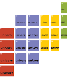
- Frutiger's method of allowing all 21 sizes from the beginning was new.
- Univers was prepared in the first place for electric composing machine "Lumitype."
- Altogether there are 17,280 letters and punctuation marks.

Tuesday, March 2, 2010
The Obscene Typography Machine
- Designers who overcome their computer phobia are mesmerized by the possibilities.
- Organizations with small budgets have easier access to better design.
- The ease of computer use put design in the hands of people who don't have any experience with typography.
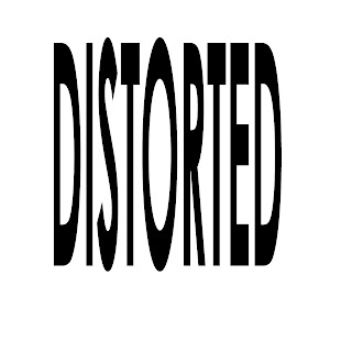
- Powerful new software give the designer the power to flip, rotate, stretch and bend typography.
- Type is being distorted in violation of everything that has been learned in the past 500 years about making beautiful letter forms.
- Type designers optically adjust each letter form they design
- One reason a typeface is considered a masterpiece is because the designer achieved optical harmony, not mathematical.
- Suddenly in 1988 anyone with a Macintosh and the right software could wreak havoc on beautifully crafted forms.
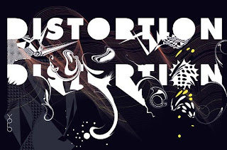
- The impact of new graphic software is being called destructive typography.
- Tremendous capabilities are being put into the hands of people who dont know an ampersand from a hole in the ground.
- Though some equipment manufacturers and software developers have made efforts to to teach design many stay ignorant.
- The Obscene Typography machine can also be the sublime typography machine.
- It allows designers to explore concepts that would have taking much more time to accomplish.
- The obscene typography machine needs to be controlled or unimaginable atrocities will be among us.
In middle school print artist was my canvas and comic sans was my paint brush. So many possibilities were open to me, If I wanted to stretch my type to fit the page I could. If I want a justified column of 10 point type and 25 point letterspacing I could. The revolution of computers in graphic design is a great one it opened up so many possibilities for designers that would have taken them months to accomplish beforehand. I could not even imagine trying to design without a computer, I could not imagine what designer had to experience before the computer was invented. However, with the good there is an overwhelming amount of bad. Anyone who decided to call themselves a designer could. Moms, children, students, and the average joe took design programs and wreaked havoc. What many average people don't realize is that a type face takes many precious hours to design. Typographers adjust everything optically so it is nearly perfect to the eye. With people not realizing how precise a type design is they don't think twice about stretching and warping type. Just because you can doesn't mean you should. This bad type design is referred to as the obscene typography machine. As long as people stay ignorant about good design us who are educated will have to suffer. The computer is an amazing design aid but it needs to be used in the right way.


Wednesday, February 24, 2010
- De Stijl
- Gerrit Rietveld
- Theo van Doesburg
- El Lissitzkyy
- Peter Oud
- JJ Oud
- Bauhaus
- Herbert Bayer
- Walter Gropius
- Moholy Nagy
Wednesday, February 17, 2010
Constructivism and De Stijl
- Kasimir Malevich
- Supermatism
- Rodchenko
- Constructivist
- El Lissitszky
- Photomantage
- Salomen Tellingater
- Prouns
- The Steinberg Brothers
- De Stijl
- Theo Van Doesburg
- Gerrit Rietveld
El Lissitsky is pivitol graphic designer of the period. His painting style known as Prous established modern enviormental design. He Formulates environment based on 3D
communication experience the way he worked and drafted with photos was truely amazing. The steinburg brothers were also amazing, the build on constructivist ideals and made the russan movie poster. They projected films and drafted from them. Its so creative and they embraced the fact that they drew and no longer photography. It was photography inspired but they were proud of them. Art movements change so easily with one persons ideas, its amazing how one idea can bring enire art movement into swing.
Wednesday, February 10, 2010
Unit 2 part 1
- Plakastil
- Cubism
- Lucian Bernhard
- Allie posters Vs. Central Powers
- Ludwig Holhwein
- Structural Linguistics
- Typographic Materiality
- Stephane Mallarme
- Similtaneity
- Synthetic Cubism
- Futurism
- Marinetti
- DADA
- Duchamp
- John Heartfeild
- George Grosz
- Kurt Schwitters
- Surrealism
- Max Ernst
- Rene Magritte
- Man Ray
Wednesday, January 27, 2010
Class 1/27
- Victorian Graphics
- Chromolithography
- Lithographic Naturalism
- Louis Prang
- John Gamble
- Ottmar Mergenthler
- Editorial Design
- Political cartoons/ Thomas Nast
- Rise of Ad Agencies
- Arts and Craft Movement
- William Morris
- Total Design
- Kelmscott Press
- Art Nouveau
- Pre-Raphaelite Painting
- Ukiyo-E wood blocks
- Cheret and Grasset
- Aubrey Beardsley
- The Beggarstaffs
- Toulouse Lautrec
- Alphonse Mucha
- Will Bradly
- Gustav Klimt
- Koloman Moser/ Gesamkunstwerk
- Alfred Roller
- Joseph Hoffman
- Modernist Era
- Glasgow School
- Peter Behrens
- Railway Type/ Edward Johnson
Wednesday, January 20, 2010
Unit 1 Part 1 & 2
Key Points
Its very interesting to think about where the written alphabet has come from and how advanced that it has gotten. I can simple understand the symbols that I am typing right now. It really boggles my mind to think about the progression of type and all the thought that must have gone into creating a very first language and not simply learning it. After a concrete alphabet is established it can not be left at that, designer's push boundaries to see far they can take the alphabet and that is when something so basic as communication becomes art. It makes me wonder where I would be right now if there was only one typeface out there. Would graphic design still exist? Or would the alphabet just be a form of communication?
- Earliest pictorial markings Africa 35,000 BC
- Ideographs and Pictographs
- Invention of writing brought about intellectual revolution
- Cuneiform is the first phonetic writing system
- Egyptian Invention of Papyrus and first “Illustrated Manuscripts”.
- Logograms
- Invention of printing 860AD
- Movable type 1045AD
- Phoenician Greek and Latin Alphabet
- Uncials 3rd Cen. AD
- Latin Alphabet 1st Serifs on Trajan Column
- Square Capitals and Rustic Capitals
- Codex
- Celtic Book Design, first drafting tools used
- Black Letter
- Block Book
- Gutenberg's Printing press and Textur
- Albrecht Durer
- Renaissance type prototype
- Aldus Manutius, Italics, pocket book
- Claude Garamond
- Transitional
- Louis Simonneau’s master alphabets
- Modern Type Bidoni and Dibot
- Monster Type, Slab Serif
- Fat Face Letters novelty of type
- San Serif William Caslon the IV
Its very interesting to think about where the written alphabet has come from and how advanced that it has gotten. I can simple understand the symbols that I am typing right now. It really boggles my mind to think about the progression of type and all the thought that must have gone into creating a very first language and not simply learning it. After a concrete alphabet is established it can not be left at that, designer's push boundaries to see far they can take the alphabet and that is when something so basic as communication becomes art. It makes me wonder where I would be right now if there was only one typeface out there. Would graphic design still exist? Or would the alphabet just be a form of communication?
Subscribe to:
Comments (Atom)